When a buyer gets serious, they stop asking "what is X?" and start asking "X vs Y?" or "what is the best X for my situation?". Those are the questions closest to a purchase, and they are the ones AI assistants answer by pulling from comparison pages. If you have not written yours, a competitor or a review site has, and AI is quoting their version of you.
Why AI loves comparison pages
An AI assistant answering "Halo vs Acme for a 50-person team" has a problem. It has to say something specific about two products, and it does not want to make it up. So it goes looking for a page that has already done the comparing, and it trusts the page that makes the job easiest.
A comparison page with a clean table is close to perfect for that. Each row is a self-contained fact ("Pricing: per user, from $12 a month"). Each column is clearly labelled. The model can lift one row, one column or the whole thing and attribute it. Compare that with a 2,000-word blog post where the useful fact sits in paragraph nine. Same information, much harder to quote.
There is a second reason. Comparison queries are where AI answers are most likely to cite sources at all, because the user is asking for specifics that can be wrong. Generic "what is" questions often get answered from training data with no link. "X vs Y" questions usually trigger a live search, and the pages it finds get the credit.
What I've seen in practice
At the B2B SaaS company where I lead marketing, AI citations went from 156 to 34,737 in ten months (compared with the previous ten). Plenty of work went into that: schema, page structure, entity fixes, the full AEO foundations. But when I look at which pages AI actually cites, the comparison pages are at the top every time. Not the thought leadership. Not the big guides. The honest tables.
I see the same gap in every audit I run. A buyer asks AI to compare a company with its main competitor, and the answer is sourced from the competitor's own site, sometimes still repeating a fact about the company that has been wrong for a year. The company never published its side, so the competitor's version won by default.
What a good comparison page looks like
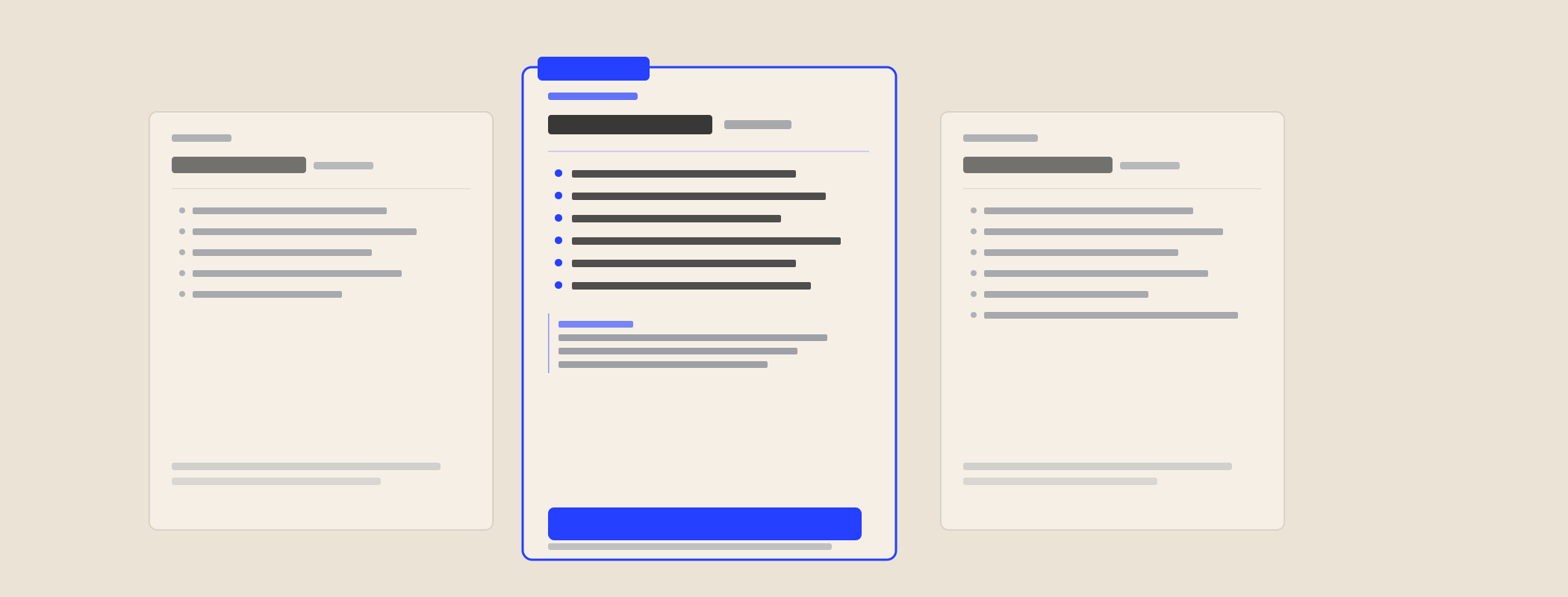
Here is the shape I use. It is boring on purpose.
| Section | What goes in it |
|---|---|
| The answer first | Two or three sentences: who each option suits best. If the answer is "them, if you need X", say so. |
| One comparison table | 8 to 15 rows. Pricing model, key features, integrations, support, where it is sold, who it suits. Plain values, not ticks and crosses. |
| Where each one wins | A short section for each option. Include where the competitor is genuinely better. |
| Who should choose which | Three or four buyer situations, each with a clear recommendation. |
| FAQ | The real follow-up questions, answered in a sentence or two each. |
| "Last checked" date | A visible date and a note on where competitor facts came from. |
Want to see one live? My own Cut the Waffle vs an SEO agency page follows this exact shape, including the rows where an agency is the better pick.
Then add the technical layer: an H1 that matches the query ("Acme vs Halo"), a meta description that states the verdict, and schema (Article or WebPage, plus FAQPage) so the page says exactly what it is.
The comparison pages worth building first
- You vs your main competitor. The one your sales team gets asked about every week.
- Alternatives to [competitor]. Buyers who are unhappy with a rival search for this. Be fair about the rival.
- Category vs category. "Project software vs spreadsheets" or "outsourced vs in-house payroll". This is where you win buyers who do not know your name yet.
- Best X for Y. "Best CRM for a 20-person NZ services firm". Only if you can be honest that you are not the answer for everyone.
- Ingredient or component comparisons. For manufacturers, comparing your input with the one buyers use now (for example, against a better-known alternative) is often the highest-value page on the site.
Why honesty is the whole trick
The temptation is to build a table where you win every row. Do not. AI systems are trying to give a balanced answer, and a page that reads like an ad is a weak source for that. Buyers do the same thing: they skip the vendor's "us vs them" page because they assume it is rigged.
A page that says "Acme is the better fit if you need on-premise hosting" earns trust on every other row. It is also more likely to be quoted, because it reads like a neutral source. You lose a row and win the answer.
The practical rules: only state facts you can source, date everything, link to the competitor's own pricing or docs where you can, and get someone outside marketing to read it for fairness before it goes live.
Beyond the website: the sales side
A good comparison page does a second job. Strip off the site navigation and it is a battle card. Sales teams send these to prospects who are weighing up a competitor, because it answers the question without sounding like a pitch.
That is why I treat comparison pages, guides, case studies and one-pagers as one piece of work: the research is the same, and the outputs serve both AI search and your sales team. More on that on the content page.
Where this fits: comparison pages work best on a site AI can already read, so they come after the AEO foundations. Want them built for you? That is content for AI search and sales.