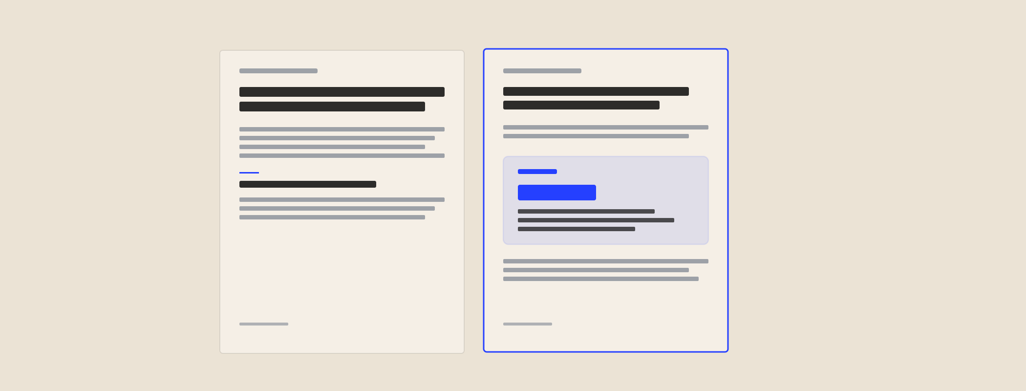
An NZ B2B services company asked me to redesign their sales proposals. Same product, same price point, same sales team. Within two quarters, the close rate was up 50%. The product hadn't changed. The proposal had. Here's the structure I built for them - annotated - and the four shifts that did most of the work.
What was broken before
The original proposals were 30-page PDF decks. Slide 1: company intro. Slides 2–8: history, values, team photos. Slides 9–12: capabilities. Slides 13–18: case studies. Slides 19–22: the proposed work. Slide 23: pricing (three options). Slides 24–30: terms.
The buyer journey through them was:
- Open the PDF.
- Skim slides 1–8 ("yes, you exist, I know").
- Hunt for the pricing slide.
- Land on slide 23, see three options without context.
- Forward to procurement.
By the time the buyer reached the actual proposal, they were buyer-fatigued. Worse, they were comparing the three pricing options against each other instead of against doing nothing. The proposal was structured to sell the company. It should have been structured to sell the decision.
The new 4-page structure
Page 1 - The buyer's problem (in their words)
Open with one paragraph quoting the buyer's own language back to them. From the discovery call notes. The shift their team is facing. The metric that's flat. The objection they raised. The proposal opens with their situation, not your company.
Why it works: the buyer reads page 1 and immediately feels heard. They're hooked into the proposal. Compare to a generic "About Us" slide which they skim and discount.
Page 2 - The recommended approach + the price
One recommended approach. Not three options. The proposal makes a recommendation - that's what the buyer is paying for. Add the price on the same page. Don't bury it. Buyers respect proposals that are confident about what they cost.
If you genuinely have options (Foundation vs Full Package), pick one as the recommendation and call out the alternatives in a small sidebar. Don't lay all three out side-by-side - that triggers comparison paralysis.
Page 3 - Proof, not pitch
Two case studies, max. Choose for relevance to this buyer, not impressive logos. Each case study: 1 paragraph setup, 1 paragraph the work, 1 line the number. Skip the team photos, the company history, the generic "we believe in..." filler.
Page 4 - What happens next
Specific next step. Not "let us know if you have questions." Something like: "Reply 'yes' and I'll send the SOW and first invoice. Start date is [day]. First milestone delivered by [day]." The proposal closes with momentum, not an open question.
The four shifts that drove the 50% lift
1. Buyer's problem on page 1, not company intro
This was the single biggest shift. Proposals that open with the buyer's situation read like the seller actually listened. Proposals that open with "Founded in 2014..." read like template-filled-in-Word.
2. Price on page 2, not buried at the back
Buyers are going to find the price. Pretending otherwise insults their intelligence. Putting the price up front signals confidence and respects the buyer's time. The deals that don't close on price aren't won by hiding the number - they're won by reframing the value before page 2.
3. One recommendation, not three options
Three options side-by-side trigger comparison paralysis. The buyer compares your options against each other instead of against doing nothing. Pick the right option and make the recommendation. If they want to negotiate, they'll ask.
4. Specific next step, not "let us know"
The proposal should close with a specific yes/no action. "Reply yes and we'll send the SOW." Or "Reply by Friday so we can hold your start date." Open questions stay open in the buyer's inbox for weeks. Specific asks get answered.
What to cut from your proposals (mercilessly)
- Company intro slides. The buyer has already looked you up. They don't need a recap.
- Team photos. Save for the website. They make the proposal look like a deck for a roadshow.
- Generic value propositions. "We're passionate about delivering excellence." Cut. Every word should be specific to this buyer.
- Methodology diagrams. Unless the buyer specifically asked, your discovery → strategy → execution diagram is doing nothing for them.
- Terms and conditions in the body. Move to an appendix. Buyers shouldn't have to wade through legal language to find the price.
- Three pricing options. Recommend one. Mention alternatives in a sidebar if relevant.
Format and delivery
- 4–6 pages max. If it doesn't fit, the proposal isn't tight enough.
- PDF, not Word doc. Word docs invite edits. PDFs feel final.
- Named after the buyer's company. "Acme-CTW-Proposal-2026-05.pdf" not "Generic-Proposal-Template.pdf".
- Sent within 48 hours of the discovery call. Speed signals seriousness. A proposal that takes 2 weeks signals you're not prioritising the deal.
- Always with a 2-line cover email. Don't bury the proposal under 200 words of context. Two lines: "Here's the proposal. Reply yes and we'll move."