A site menu is the only piece of your website that appears on every page, gets seen by every visitor, and is rebuilt approximately never. It is also the single element most likely to have been decided in a meeting where the loudest person owned the biggest division. That combination is why so many B2B sites have high traffic and low enquiries.
The symptom you actually noticed
Nobody rebuilds a menu because the menu feels wrong. They rebuild it because of the symptoms:
- Your service pages get traffic but almost nobody moves between them
- Sales keeps sending links to pages prospects "could not find"
- Your contact form fills in the wrong service, or leaves it blank
- Search Console shows people searching your brand plus a service name - they know you do it, they just cannot find it
- Your homepage does all the work because it is the only page people successfully navigate from
Every one of those is a categorisation problem wearing a different hat.
Why menus end up as org charts
It is not incompetence, it is gravity. The people who decide the menu are the people who work there, and internally the divisions are real: those two services genuinely are run by different teams, that product genuinely came from an acquisition, that group genuinely reports to a different director.
So the menu ends up with categories like "Managed Services", "Professional Services" and "Solutions" - three labels that mean something precise inside the building and nothing at all outside it. A buyer cannot tell you which of the three contains the thing they need, and they will not run the experiment. They will use search, land on one page, and either convert from that page or leave.
The tell is easy to spot: if your top-level categories would need explaining to a new customer, they are internal labels.
The principle: group by job, not by team
Buyers arrive with a job to be done and a rough idea of what it is called. They do not arrive with a delivery model. So the groupings that work are the ones that match the shape of the problem:
- By outcome - "Grow revenue", "Reduce cost", "Stay compliant". Strong when your buyers are senior and your services are abstract.
- By the thing itself - "Website", "Content", "Reporting". Strong when buyers search by service name, which in most mid-market B2B they do.
- By audience - "For finance teams", "For operations". Strong when the same service is sold very differently to different departments.
- By stage - "Plan", "Build", "Run". Strong for long engagements where buyers enter at different points.
One of those should dominate. Mixing two is where menus go to die: a nav with "Solutions", "For Manufacturing" and "Consulting" side by side is asking the visitor to work out which axis they are on before they can click.
Seven rules that do most of the work
1. Cap the top level at seven items
Including the CTA. Beyond that the menu stops being scanned and starts being read, and a read menu is a decision the visitor has to make rather than a path they follow. If you cannot get under seven, your categories are too specific.
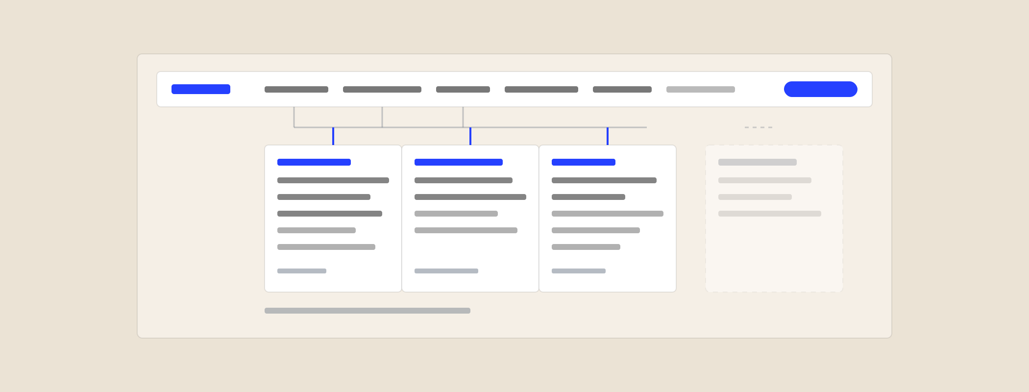
2. One level of dropdown, not two
Nested flyouts are a mouse-accuracy test. If a category needs a sub-sub-level, it needs its own landing page with the detail on it - which is better for search anyway, because that page can rank.
3. Use the words your buyers use
Not your internal product names, not the clever ones. Pull the language from your own search queries, sales call notes and the subject lines of inbound emails. "Website audit" beats "Digital Diagnostic Suite" every time, including in search results.
4. Every category needs a real page behind it
A dropdown trigger that goes nowhere is a dead end for anyone who clicks it and a dead end for search. Category pages are also where you explain the grouping, which is exactly the job a menu label is too short to do.
5. Order by demand, not by revenue or politics
Put the things most people are looking for first. The high-margin service does not belong at position one just because it is high margin - it belongs wherever the people who buy it will look. First and last positions get the most attention; use them deliberately.
6. Anything that matters is reachable in two clicks
Pick your fifteen most important pages and count the clicks from the homepage. Anything at three or more is functionally hidden, and the same depth signal tells a crawler the page is not important either.
7. Keep the CTA out of the categories
"Get in touch" is not a content category and should not compete with one. Style it as a button, park it at the end, leave it alone.
How to actually do the restructure
This is a two-afternoon job, not a project.
- List every real page that a customer might want - services, sectors, tools, proof, pricing. One line each. Most B2B sites land between 25 and 60.
- Strike out the pages nobody should be looking for. Old campaign pages and half-finished service lines do not get nav space. They get deleted or redirected.
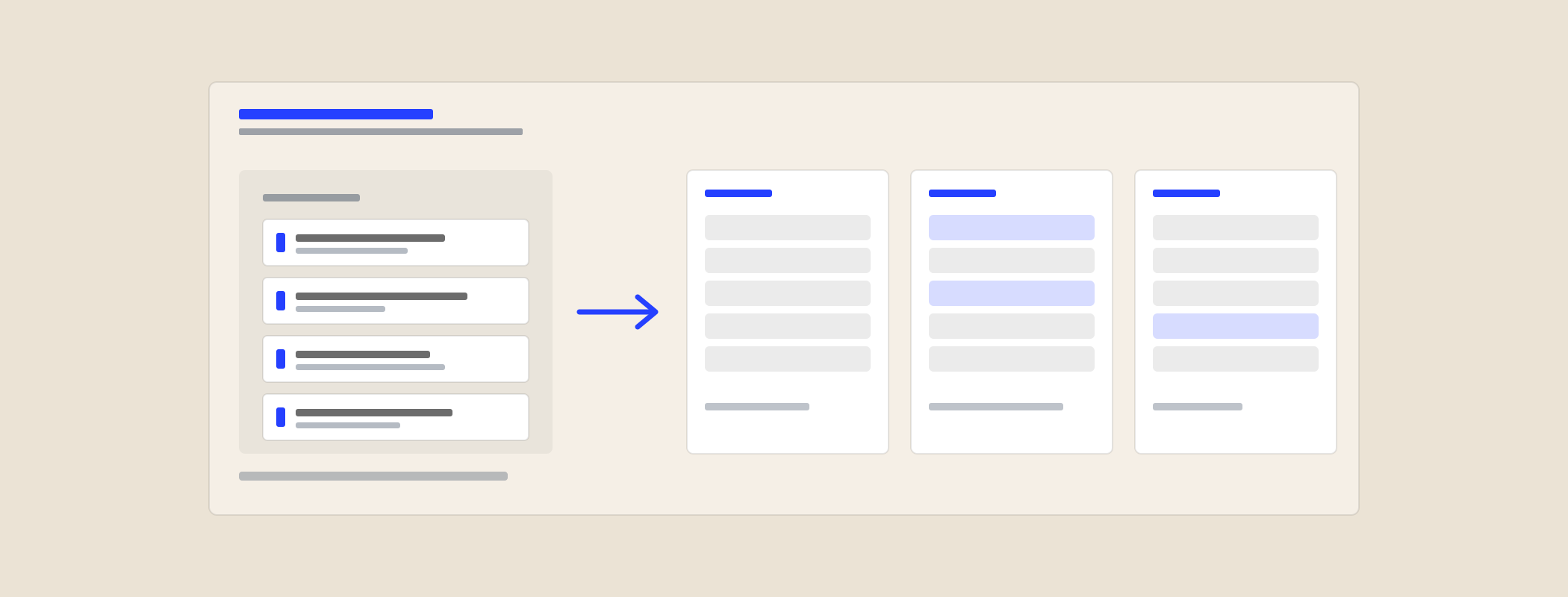
- Group them three different ways using three of the axes above. Force yourself to do all three - the second and third always surface something the first missed.
- Name each group in buyer language and check each name passes the explaining test.
- Prototype all three versions as clickable menus rather than slides. Opinions about a picture of a menu are worthless; opinions about one you can click are not.
- Run the first-click test (below) on five people who do not work for you.
- Ship the winner, keep the URLs, and redirect anything that does move.
Two tests that settle internal arguments
The first-click test
Give five people outside the business a realistic task - "you need help getting your annual report online, where would you go?" - and record only where they click first. First clicks are strongly predictive of whether someone completes the task at all. If three of five hesitate or click the wrong category, the label is wrong. This takes an afternoon and outranks any amount of internal opinion.
The card sort
Write each page name on a card, hand the stack to someone who does not work there, and ask them to make piles and name them. You are not obliged to use their groupings. You are looking for the places where their instinct and your structure disagree, because those are precisely the places visitors get lost.
The search side of it
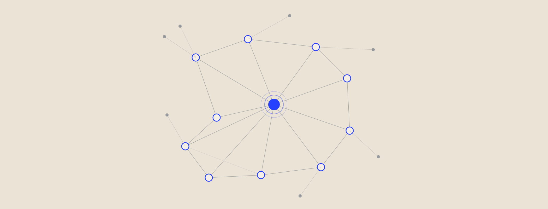
Navigation is not a cosmetic layer - it is the strongest internal linking structure on your site, because it appears on every page.
- Link depth signals importance. Pages buried four clicks deep get crawled less and treated as less significant.
- Menu labels are anchor text repeated sitewide. "Solutions" tells a search engine nothing; "Website audit" tells it a great deal.
- Category pages are ranking assets, not just signposts. A well-written parent page often outranks the individual children for broader queries.
- Clear grouping helps AI answers too. When a model is deciding what your company does, an unambiguous structure is a much easier thing to summarise than a mystery box labelled "Services".
If you do move URLs, redirect them properly and update internal links rather than relying on the redirect. A restructure that loses your existing rankings is not a win, however much better the menu looks.
What not to do
- Do not add a mega menu to avoid making decisions. Forty links in a panel is the same problem with more surface area.
- Do not rely on search to rescue a bad structure. Site search is used by a minority of visitors, and mostly by the ones who have already failed to navigate.
- Do not give every internal stakeholder their own top-level item. That is how you get back to the org chart with extra steps.
- Do not rename everything at once without redirects and an internal heads-up. Sales will keep sending old links for months.
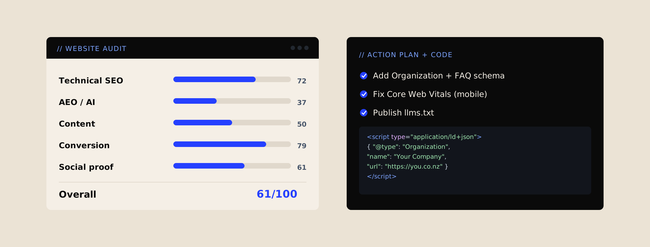
If you want an outside read on it, that is part of what a website audit covers - where a first-time visitor gets stuck, which labels are internal language, and what I would restructure first.